Using color psychology for branding
What colors will describe your brand values most effectively?
Not sure what colors will best represent your brand? Immerse into the story of each color, what emotions and feelings you’ll generate with them, and create an intentional palette for your brand.
“Color! What a deep and mysterious language, the language of dreams."
Paul Gauguin
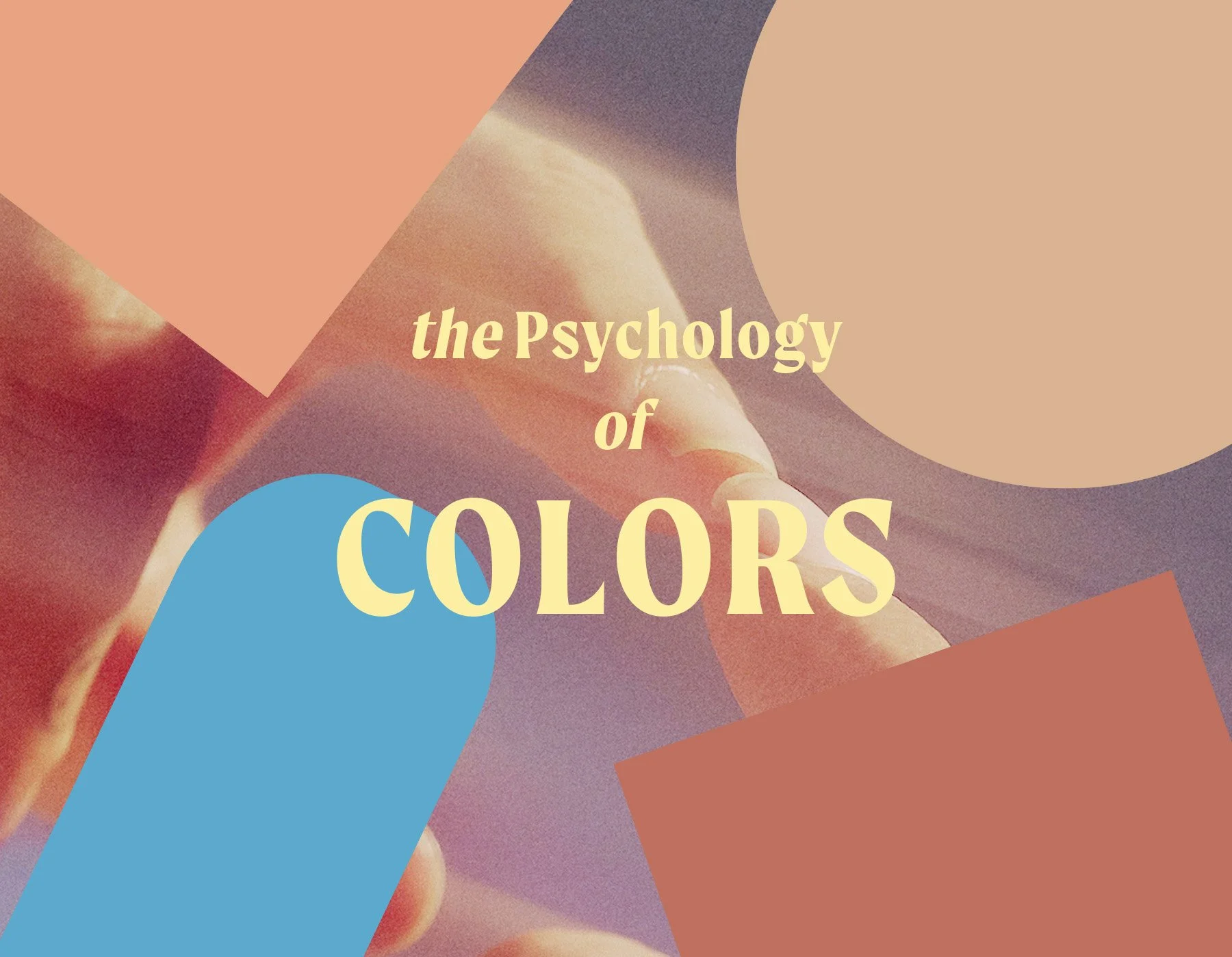
01. Intro to color psychology
Color is a language that speaks immediately to our emotions. It’s similar to music in the way that we can immediately feel it without a verbal explanation. It’s perception. And very subjective. But since we’re all humans with beating hearts (I hope) there are some commonalities in the way we perceive color. How red comes across, as opposed to white for instance.
And as important as the color itself, is the way the color comes across; through what medium: whether through illustration, photograph, or the color of your text and background, the feeling of the image and subject is just as potent as the color itself.
So let’s dive into how you can intentionally create the perception of your brand.
(individual images on each mood board found on pinterest)

COLOR - RED
A very strong color full of statement. Here are some keywords I’ve gathered that the color RED conjures in our psychology. The way you’ll use it in your branding could be full background splashes of red, to photography that uses red objects or clothing to using red as an accent color on a more neutral and monochromatic color palette. Keep in mind that using red in the wrong places could cause unnecessary attention or alarm.
Seductive
Warm
Tough love
Loyal
Royal
Exclusive
Rule-breaker
Risk-taker
Extrovert
Bohemian
Unique

COLOR - BLUE
The color blue is mostly associated with sedative and peaceful feelings. There are a lot of brands that are financial or medical institutions that use blue in their color to establish immediate trust. It makes sense to use blue to transmit the vibe of trustworthiness and safety. Here are some keywords that the color blue could signify.
Royalty
Novel
Trust
Mysterious
Introvert
Quiet
Calm
Conservative
Fresh
Bold

COLOR - YELLOW
The psychology of color yellow is all along the happy spectrum. Is it because it’s the color of our sun that makes life possible on earth? Or is it because gold is the color of the sun, and also stands for material abundance? Using yellow in your branding could be a powerful communicator that you stand for positivity and happiness.
Newness
Joy
Innocence
Playful
Spring
Warmth
Friendly
Cheerful

(individual images found and shared from pinterest)
COLOR - GREEN
Green is complex. It could feel very young - if you use its more vibrant and fresh tones, and it could feel very mature if you use its darker, richer range. It could feel down to earth and youthful, or luxurious and experienced. Using light mossy green for instance, could even feel earthy, minimal and friendly. If you feel drawn to the greens, make sure you explore its different ranges within the green tonality and check in with how it feels to you personally.
Organic
Fresh
Youthful
Earthy
Luxurious
Groundedness
Maturity
Unconventional
Hopefulness
Life
Energy
Wealth

COLOR - WHITE (NEUTRAL LIGHT)
There’s a reason why the default color of blank papers, documents, empty spaces, walls are white. White is ‘tabula rasa’ and you can use it safely in any situations because what it conveys is.. a blank state. If you explore the range of white that verges on creme - into their warmer or cooler tonalities, you could start to tell more stories. Here are some meanings that white and its neutral light ranges can signify:
Pure
Calm
Pristine
Clear
Essential
Neutrality
Space
Breath
Cool
Minimalism
Quietness
Acceptance

COLOR - DARK TO BLACK
Black and its neighboring dark tones can create a dramatic effect. Even if it’s on the direct opposite side of white, it could serve as an ‘empty slate’ to carry its foreground elements when used as a background. When used directly in an image, its zen-like purity is striking and bold. See all the words and meanings that the color black induces:
Dramatic
Purity
Potent
Cinematic
All-encompassing
Mysterious
Possibilities
Elegance
Power
Boldness
Strong
Dignified
SUMMARY
Now that you’ve immersed yourself more into the psychology of colors - what colors come to your mind as you imagine your brand manifested as a visual form? If you were to receive your audience in the ‘space’ of your brand, what colors would be its walls? What colors would be your furnitures?
Whether you’re using one color prominently in your brand, or a combination of colors, there’s no right and wrong - just a feeling that there’s a ‘resonance’ between the colors in a palette that show the spirit of your brand. Some people can get into the whole science of it - but I, personally as an intuitive visual designer, look for a certain feeling. Have fun exploring!
Explore more topics


Bright Matters Studio
is led by Kathy Suyun Kwon, creative strategist, designer and visual artist. She’s passionate about helping entrepreneurs in the holistic space create brands that emanate magic.
